Pages

Sunday, 25 August 2013

carnival, fort edmonton park august 2012

One of my favourite outings last summer was our trip to Fort Edmonton Park (see bill's confectionary fort edmonton park august 2012 for  more of the story).   Alex and I spent some time with friends walking through the park and ended the day in the midway with a ride on the carousel and Ferris wheel.


I started this manila 12x12 with a layer of gesso to prime the page and prepare for empty spaces.  The background was created with a layer of carnival images I printed in black & white and sepia, a sheet of white tissue paper, a crazy circle stencil and Tim Holtz distress inks.  I used broken china with the stencil and then distressed the edges of the layout with tea dye.  I also added some tea drops throughout using Earl Grey.   


I love the event banners which line the midway - bearded lady, strongman - and so my version of the advertisement banners was taken from the Graphic 45 Find your Wings and Fly paper.  I free-hand drew in posts holding up the banners.  I am really enjoying including some free-hand drawing in my pieces.  It has a great homegrown authentic feeling.


The  prescription eyeglasses are from the Graphic 45 Olde Curiosity Shoppe Collection and I cut the Ferris wheel out with the Silhouette Cameo.  The red and white strips beneath the Ferris wheel were b-side scraps from the Graphic 45 Find your Wings and Fly banners.


I had a great deal of fun putting this page together and I definitely will use these techniques again in my art journal (whenever I get that going).  Working with tissue paper is incredible.  It adds texture and dimension to the art piece and it's relatively simple (as long as you're okay with it not being perfect).  I'm entering this page in Simon Says Stamp Carnival Challenge.

Thank you for stopping by and all of the encouraging comments.  You're all so very sweet and kind.

Thursday, 22 August 2013

rusty the invermere moose august 2012

For those of you who have been following along in my adventures you know that the family (Alex, mr. everythingshetouches, Baba, Dyeda and myself) went on a fabulous road trip to Fairmont, British Columbia last summer (bavarian mining railway north star school august 2012).  Invermere, B.C. is 37km north of Fairmont Hot Springs and is a summer destination to approximately 36 000 visitors on weekends throughout the summer (population 4000).  Invermere is also home to Rusty, the Moose, a large Canadian roadside attraction.  I'm a sucker for (a) large Canadian roadside attractions and (b) moose which equals photo op.


I layered a stitched piece of material, packaging, wooden moose, washi tape, metal sprockets, chipboard gears, distress inks and acrylic paint onto Hot Off The Press Steampunk paper.  The moose trio are wooden cutouts that I found at Walmart for a dollar (a dollar for a package of three moose and three moose heads!  The moose heads are a bit too odd for me and so they may be migrating to another happy home.  I'll have to see if I can come up with an art piece which incorporates moose heads.  If you want them let me know.  I'm sure we can get moose to travel without much hassle) to which I applied gesso, white acrylic paint and weathered wood distress ink.  I gave them personality by adding washi tape and, from Tim Holtz Visual Artistry The Journey, the phrase enjoy the journey.  I love that statement.  Simple and yet so meaningful.  The argyle stamp (Tim Holtz's Stampers Anonymous) behind The Dude (the largest moose on the right; the other two are Walter and Donny for all you Big Lebowski fans) was added with white acrylic paint.  Yeah, I named the moose.  The enormous gear photo was actually taken on our trip to the Bavarian Mining Railway in Kimberley, B.C.  It's a bit of a cheat but it fits in nicely with this layout and I just couldn't resist.


I love the little Steampunk-esque hat on Donny.  It is from the Dylusions Couture Collection set stamped onto watercolour paper and coloured in with markers.  The feather was drawn free-hand.


The sprockets are Tim Holtz sprocket gears.  The gears were cut using my Silhouette Cameo.  You can't see it but I'm grinning.  I painted some of the chipboard gears with Martha Stewart Crafts acrylic pearl paint (aquarium) and others with FolkArt metallic acrylic paint (antique copper).  The large gear at the top in the photo below was painted with antique copper and embossed with black embossing powder.  I added the powder to the very wet paint and heat set it.  The bubbling drying paint created a bit of a crackle effect which I absolutely adore.  The gear has an incredible texture now and really sets up that corner of the layout.


I added more argyle and numbers from an eye chart stencil in white acrylic paint to the top right of the layout.  The hexagons are Tim Holtz distress ink peeled paint, applied with a stencil and doodled with my black and white gelly roll pens.


The gauzy material was doubled over and stitched free-hand with grey embroidery thread.  I also added the packaging from the Tim Holtz sprocket gears set which I randomly tossed about the page (somewhat randomly.  Perfectionist Pam only permits a calculated amount of randomness.  I found more freedom in doodling than I have in "random" placements).


I created a Rusty Moose tag to tuck away in the back of the layout.  I love making tags.  I recently purchased my first art journal and I have yet to crack it open.  Perhaps once I create my first page the trepidation that comes with new blank pages will lessen, however, at the moment I feel incapacitated.  I need to transfer the tag and doodling joy to the pages of the art journal somehow.


I am entering the Rusty Moose layout in About A Boy's mid-August Challenge: Anything Goes.  I am so honoured to be In the Spotlight for About a Boy August 1st Back to School Challenge.  The design team is incredibly talented and the entries are very beautiful.  You should definitely check them out.

I have a few more posts lined up for the end of August, including PJ September New Technique Challenge and a craft outside of the world of paper.  Be sure to come back and visit.

Sunday, 18 August 2013

silhouette cameo .. i found a stray and he followed me home

I tried telling mr. everythingshetouches that I found this poor little critter by the side of the road and that he followed me home but mr. everythingshetouches is far too wise for stuff like that.

The truth:  this little guy was on super sale and I couldn't resist missing the great opportunity to bring him home five months earlier than planned (do you think mr. everythingshetouches will forget this was an early Chanukah gift by the time Chanukah Harry actually rolls into town with his bag of goodies?  Yeah.  Not likely).


And even on sale (did I mention that it was a really good sale? - 40% off!) I struggled with the idea that I hadn't done enough research to bring this baby home and crack it open the minute the keys hit the bowl and the door closed behind me.  So for two days the box remained closed and I watched YouTube videos on how to use the Silhouette Cameo and read countless reviews.

On day three I opened the box.  Set up was easy peesy lemon squeezy.  Cutting?  Not as much.  Here's my first unsolicited bit of advice: don't open a new machine after 10pm.  Fatigue, technology and despair don't mix like White Russians and red wine.  Save the grand opening for a time when you (a) have time and (b) don't feel the need to check your eyelids for holes desperately (I'm no longer a night owl).

In my search for answers as to why the Silhouette would not cut through the paper (or when I had more hope - chipboard) I found that there is a bad batch of blades included with the Silhouette itself.  A quick, and very nice, call to customer service taught me that Silhouette does not ship to Canada (was my machine somehow smuggled across the border by the store elves?) and I was on my own to procure a replacement blade ($21 at Michaels which is almost as much as the Silhouette itself.  Criminal!  They're $16 at Treasured Memories which is slightly better).  The Michaels staff member was quite sympathetic and very accommodating.  And with great trepidation and a series of plan Bs if the new blade did not work I plunked it into the machine and I cut my first image.  Success!  And then I cut another and another and well, you can see for yourself I had a lot of fun.


Now the mission is to maximize Silhouette functions to really enjoy my newest toy.  Perhaps I can teach it to also clean the house ..

Thursday, 8 August 2013

the man who will use his skill and constructive imagination to see how much he can give for a dollar, instead of how little he can give for a dollar, is bound to succeed - Henry Ford

Sometimes when you go garage sale-ing you come home with a little treasure.  This Ford Model T, also known as the Tin Lizzie, was not only a great find because it's simply a fantastic design and made completely out of metal but it is also a music box.


I debated painting it black or covering it with paint, gel medium and embellishments and decided that for now it will live as it was found.  Distressed.


The crank at the front of the car can be turned and the best part: the hood rises and falls as the music plays.  Super duper bonus: the music box isn't mint condition and so the music has a very tinkly twangy sound quality and is creepier than a clown under your bed. 


Did I mention that this little aptly named find was $4? 


So what do you think?  Should the Ford Model T be re-designed?  If so, what would you like to see?

Saturday, 3 August 2013

bavarian mining railway north star school august 2012

It wasn't difficult selecting a photo series to highlight the adorable layout designed by Kathleen at Treasured Memories.  

Kathleen's original layout as demonstrated in class

The family: Alex, mr. everythingshetouches, Baba and Dyeda took a road trip last summer to the beautiful and majestic Fairmont, British Columbia.  Although I have now lived in western Canada for almost seven years, it my was first real trip to B.C.  I had been to the Vancouver airport twice, however, it didn't capture the stunning beauty for which B.C. is famous.  I was born and raised in Montréal and spent a few great years in Ottawa getting educated.  The plan: finish my  undergraduate degree in psychology research and acquire my masters and post-doctorate degrees at the University of  British Columbia in the faculty of psychology.  The reality: finish my undergraduate degree in psychology research, move back to Montréal to attend McGill University and obtain my masters in Special and Inclusive Education.  I would have never imagined that I would one day live in Alberta and have the wonders of B.C. in my backyard.  But as beautiful as B.C. is, Alberta has captured my heart.  It is a province filled with stunning and diverse landscapes and amazing people.  It is simply breath-taking.  If you haven't yet had a chance to visit Alberta I strongly recommend the trip and no, I do not have shares in Travel Alberta.

Anyway, back to our trip to Fairmont, B.C.  There are some very fine hot springs in Fairmont (as well as in Banff, Alberta - okay, okay, I'll let up slightly on my province-mance with Alberta) as well as, if you like that sort of thing, golf.  It really is a golfers paradise with lush greens and the Rockies as your backdrop.  A little over an hour south of Fairmont is the sleepy little town of Kimberley, B.C.  From 1917 to 2001, Kimberly was the home to the world's largest lead-zinc mine  and  now  operates  as a tourist destination, especially for skiers, and includes the Kimberley Underground Mining Railway that features a  230m underground mining interpretive centre and is the home of Canada's  largest cuckoo clock.  The  Bavarian  Mining Railway North Star School is a small one-room schoolhouse  where Alex, without hesitation, sat down  and began drawing out his adventures using the complementary  paper and crayons.


I  digitally modified  the  photos to  better  fit  with  the vintage feel of the layout and contrasted the third photo of the desk and chalkboard by printing it in black and white. 


I outlined the layout, and added throughout the two pages, tea drops.  Who thought a simple concept like home-brewed earl grey tea could have such  an  impressive effect? According to Kathleen, different hues in teas will have different effects on how it appears on the layout.  Makes sense.  Blueberry tea will have a blue hue, green tea a green hue, orange pekoe .. well, you get it.  And tea is one of those things that I definitely have lying around the house.  In fact many of the elements used in the layering of this project are items that you most likely have lying about or, if not, you can take away the lesson that almost anything can be re-purposed and included in your project. 


Remember re-purposing can give the item a whole new function, sometimes making it very silly (it looks better on the layout).


The  cup rings and ink drops were stamped on.  And  I free-handed the accent doodle line around the edge of my pages with my black gelly roll.


I have never felt comfortable journaling (hard to believe, right?) and so many of my layouts are void of any conversation or description of what was happening when the photograph was taken.  My fear is that as we look back through my work and layouts I will not (a)remember the details of the event or the story itself and (b) be around some day to tell it.  One of my recent (last two months or so) promises to myself is to try and journal at least once directly on my layout but until that day arrives I have included my sentiments somewhat hidden from public view by tucking a tag away behind the layout.  The one used for this project was pre-made but I love creating tags (you might have noticed) and need very little prompting to create ones which will tie into the layout theme.


I love the variety of materials used, as I mentioned before, to layer and add dimension to the project.  Layers included aged pages of a book, cardstock, printed vellum, packing materials, drywall tape, rope, wired wool and a zipper.  There seriously is a lot going on in these two pages.


I'm not a fan of doilies and my original plan was to leave it off of the layout entirely, however, I cracked open my weathered wood Tim Holtz distress ink and distressed it.  In the process it ripped and somehow I fell in love.  I gathered up the pieces, tucked it between the layers and there it remains.


The butterflies were printed onto cardstock, cut out and the wings were curled around a pencil (or whatever round tool of choice) to give it a really fun and three-dimensional effect.  I added liquid glass to some of the butterflies for even more fun and I intentionally had them flying in a unified direction to give the layout some movement.


I'm entering this layout in a few challenges:


I really had a blast making this layout (thanks Kathleen, my die cut conspirator and the hysterical ladies in this class) and thank you for stopping by and visiting. 

Monday, 29 July 2013

christmas in july, a trio of tags

There's something enchanting about designing and creating winter holiday tags while sipping iced tea in the sun on the porch as Alex runs around in his shark bathing suit blowing bubbles.

I'm celebrating CHRISTMAS in July for Anything But a Card's Challenge #24.  I have to admit there was some brain resist to crafting winter anything in the middle of July but once I dug out the holiday stamps and embellishments the struggle gave in to delight.  Out of all of the stamps that I own, Alex selected these three (stocking, magen david and door stamp).  I, in fact, just landed the door and wreath stamp from a friend and was very happy to use it in this project.


Tag one: stocking and chimney tag.  All of the over-sized tags are from the Prima collection.  This one was distressed with Tim Holtz's distress inks (black soot, fire brick red) and layered with some bits and pieces I had lying around to give it some oomph.  


The bricks were textured on with a mini brick stencil and some modelling paste to which I added a mixture of red and brown acrylic paint.  I've started making my own modelling paste. If you don't mind the making-it-yourself part and the cleaning-all-the-materials afterward bit I recommend it.  The bricks were then highlighted in metallic paint and viva decor pearl pen.  The stocking is from the Stampin' Up collection.  I love the stretched out image.  Something very fun about a very long stocking.  Perhaps I can imagine all the gifts that are hiding inside.  Although a stocking with that shape would mean that the gifts would have to be really long and thin like golf clubs (don't need them) or an umbrella (don't want one) or a hockey stick (not my thing).  It wouldn't fit a Cricut.  So as cute as it is I'm hoping this year my stocking comes in a regular shape the size of a Cricut box.  And so you've also noticed that I'm not much of a hint-er (yes, mr. everythingshetouches reads my blog).  All you romantics can stop rolling your eyes. 

My aunt Anna, who is a seamstress by hobby and a teacher by trade, had given me a bag of sequins to use in my projects and it seemed fitting for the trio of winter tags.

I added the cotton from a cotton swab at the top of the chimney and filled in the cracks between the bricks with black soot used as a watercolour.


I love this ribbon which looks like Santa's belt buckle and the red and white washi tape.


mr. everythingshetouches recommended that I turn the strip of washi at the bottom of the tag into a gift.  He's filled with great design ideas!  I had already taken the photos of the tags without the washi tape-turned-gift and so you might notice the gift missing from the first two photos.  We could have played a short game of can you find the error in these photos!


My family is a blend of folks from around the world and so we celebrate both Chanukah and Christmas every year.  Alex had made some beautiful ornaments at school last year and informed me that we now needed to purchase a Christmas tree to display his art.  We didn't buy a tree but we did create something special in the sun room and in the hallway where we could exhibit all of our crafts, ornaments and cards.  I'll try to remember to take photos this year to post.

Tag two: Magen David Chanukah.


The tag was distressed with Tim Holtz distress ink (broken china) and decorated with viva decor pearl pen pearls.


The Stampin' up Magen David was a gift from a friend.  The Magen Davids were stamped onto 90lbs watercolour paper (love love love this paper) and I coloured each one in with a marker.  The paper was distressed with black soot and a few of the stars were highlighted with liquid glass.  I splattered on some broken china to add dimension.


Tag three: Coming home.  The tag was distressed with Tim Holtz's distress inks (painted door, tea dye).  I am really thrilled with the way the distressing turned out on this tag.  I love using distress inks as a background and this session really turned out spectacular.  It is so fun laying your medium (in this case watercolour paper) down on the inks and pulling it up to see what beautiful creation awaits.  And it changes each time to you lay it down.  No two pieces are alike.


The door was painted with markers and distress inks used as watercolours.  I added sequins and viva decor pearl pen pearls as highlights and a bit of jute for some whimsy.


My dear friend who gave me the door and wreath stamp also turned me onto Memory Box die cuts found at Urban Scrapbook I used the Tall Birch and Forget-Me-Not branches for this project. I'm hooked on die cuts now.  It's my newest muse.


Before distressing the tag I embossed branches across the bottom.  The effect is subtle but really very nice especially with the distress inks following the embossed lines.


I had so much fun designing and creating these tags and I wish all of you loads of warm winter wishes in July.

ETA:  I am adding my holiday tag trio to the Moxie Fab World Holiday Gift Tag Challenge to be eligible to participate in the challenge.


Sunday, 28 July 2013

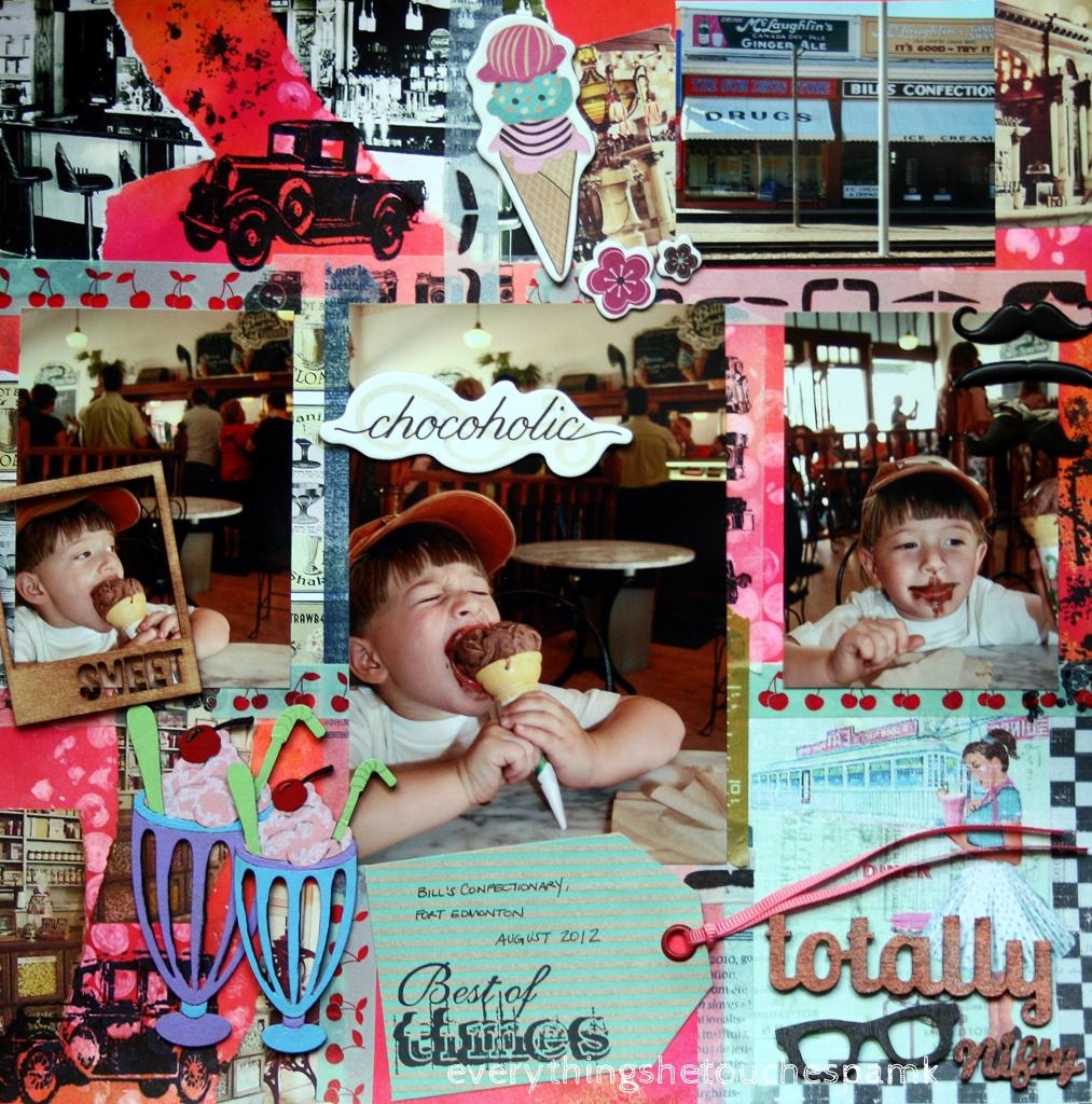
bill's confectionary, fort edmonton park august 2012

Alex and I went to Fort Edmonton Park last summer and spent the day with friends wandering through the four historical periods between 1846 and 1920.  I wondered how Alex would respond to the live presentations of the historical relics being only three years old at the time but I was a very proud mama with his behaviour, stamina and maturity.  He asked the staff some very poignant questions about their work and managed to walk around the park for the better part of five hours stopping only for a 30-minute movie and lunch.

Although our friends were ready to pack it in after five hours, Alex asked me if we could play a game of mini-putt, get some ice cream and ride the ferris wheel.  I have some great photos from the entire day that I will likely work into a couple of layouts so consider this post as the teaser.


I found the cherry washi tape, 50's diner paper, ice cream float chipboard and Basicgrey Hipster embellishments at The Inked Stamper all which inspired the one-page layout.  I love the concept of having multiple elements, each with their own design, coming together to create a greater picture.  Gestalt psychology
is a theory developed from the principle that our brains are capable of perceiving whole objects out of incomplete elements. Kurt Koffka had coined the phrase "the whole is other than the sum of the parts".  Each section of the layout is outlined with assorted washi tapes.  My favourites: cherry washi, camera washi and mustache washi.  It's going to be a sad day when I run out of those three.  I'm pretty sure I'll look back on this time fondly knowing that I had a great adoration for cherry, camera and stash as every project will have as least just a hint of each tape included.  Or almost every project. 

I'm on a collage kick lately and found some really fun ice cream shoppe images to incorporate into the layout which was first sprayed with Ranger Dylusions Ink (squeezed orange and bubblegum pink).  I added white bubbles with bubble wrap and Tim Holtz Distress Stain Ink (picket fence) and some random ink blotches.  There is a great stamp set which has circles or bubbles included (which I don't own) but for some reason I just had to try making my own bubbles with the wrap.  It worked like a charm and I'm completely hooked.  Now I have to figure out how to include my used bubble wrap into my projects.  I'm sure it'll look really fun on an art journal layout.  Friends expect a card or two with bubbles and/or bubble wrap.  The ink splotches and bubbles represent some controlled chaos: ice cream can be messy.  The Ford Model Ts are from Tim Holtz's Visual Collection: The Journey.


mr. click, print, scrapbook and I spent a day together planning out our layouts and painting our ice cream float chipboards with acrylic paints.  We highlighted some of the float details with Tim Holtz's Distress Marker (picket fence) and outlined the glasses and cherries with gelly roll pens to give them some definition.


Our trip to Fort Edmonton Park last summer is one of my favourite outings of the summer.  I look forward to sharing the other photos, layouts and memories from that day with you.


Tuesday, 23 July 2013

a prima parisian birthday card

I like The Eiffel Tower because it looks like steel and lace
― Natalie Lloyd

I created this birthday card for one of my colleagues. I wanted something elegant and yet not too girly.  Aren't the Prima Doll stamps really nice to work with?  They're like a great little blouse that you can dress up to wear out to that very chic restaurant or dress down to wear to Starbucks for your skinny vanilla latte fix.  The Swing Dress Prima Doll stamp offers the same versatility.  For today's card she is wearing an original Recollections: Tattered and Worn cardstock dress on a Prima tag set against a Recollections: Tattered and Worn cardstock background.  Work it little Ms. Swing Dress.


The tag was sprayed (dirty martini, calypso teal), distressed (tea dye, dusty concord) and collaged before I stamped on Tim Holtz's Eiffel Tower, decorative border and argyle images.  For Ms. Swing Dress' hair I used vintage photo distressing ink as a watercolour and for her shoes I used worn lipstick.  I'm not a huge pink fan, although I do admit it definitely has its place, but I couldn't resist buying worn lipstick for the name alone.  Many years ago, one of my Montréal friends had pointed out the sometimes fantastic names of nail polish and lip gloss and I was hooked.  I will at times indulge in a lip gloss if I think the name is uber adorable or if I'm debating between two colours the name will become the deciding factor.  Seriously.  Worn Lipstick.  Adorable.  Inspirational.


I layered the dress on top of Ms. Swing Dress' first newspaper print paper layer and then doodled the edges and frill with my distress marker picket fence.  I absolutely love the way the stamp is made.  Without any additional materials the dress appears as it should on top of the doll's body giving the illusion of a doll wearing a dress.  No pop-ups, no fussing.  I love working with these stamps.


I thought the banner added dimension and a touch of sweetness and colour to the top of the tag.  I had hand-drawn the banner attachments (do you see the tiny "x"s?) and the ribbon or string tying them together.  I also added some hint of washi tape for a bit of layering and fun.


I really like using more than one ribbon and for this piece I varied the colour and the texture of the ribbon although both are elegant and pretty simplistic.


I'm entering my Ms. Swing Dress birthday card in the Simon Says Stamp Monday Challenge: Celebrate.  Congratulations on three successful years and the new location move.

ETA: I've edited this post so that it may be eligible in the Moxie Fab World Challenge.
Ms. Swing Dress is now entered to participate in the Birthday Card Challenge in the Moxie Fab World. It would be wonderful if she was the belle of the ball.

Happy birthday dear colleague.  I wish you many years of laughter, joy and love.

And thank you everythingshetouches-blogsters for viewing my work over 1000 times!  I  love when you stop in, relax, have a coffee and drop me a line or two!