we must attempt the impossible. to be all that we can be, we must dream of being more.
Tim Holtz's Visual Artistry Stampers Anonymous quote and my husband's 40th birthday were the inspirations for a very fun card and my very first blog entry.
You may start to notice that I love very busy pieces. I love noticing new little things each time I revisit a piece of art, a book or movie. There's something magical in contemplating artwork for the 80th time and just then finding a little something new. One of the many reasons I love artists like Jackson Pollack or Sandor Derrick. And I tend to design and create in the same way - filled to the brim with bits and pieces that intrigue and delight me.
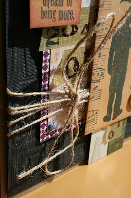
Isn't the gent with the umbrella fabulous? It's really not hard to create when you have a little Tim Holtz. I knew immediately that my gent had to be front and centre. And although he has plenty going on (he's littered with data - did you notice?), the musical notes and brads added the texture I wanted and filled in some of the bare space. I'm seriously going to try to create a minimalist card one day and see how I fare.
The black background is surfaced with a multiple square Cuttlebug embossing plate and the paper are odds and ends from other projects. I promise to keep better track of my materials in the future, however, you may be disappointed to find that many items are ideas of long ago as I slowly work my way through my collection. My apologies in advance.
The first strip of paper with images in eggshell and grey came from a 12x12 Moscow paper which I used to create a three generation of family men in a two-page scrapbook layout. My husband's family originated from Minsk, Belarus. Not quite Moscow. But the intention of tribute is authentic.
The jute and washi tape are smidges of added fun. The musical notes stamp was a huge find in the discount bin at Michaels. Can't beat $1.50 and I'm pretty sure I have used the stamp a billion times in my projects. I'm not exaggerating. Okay. Maybe a bit. The ink is ColorBox Dragonfly Black. It's fine but I found something far more exciting. I'll tell you more about that in a later post.
I really like the way the inside of the card worked out. I took a regular piece of printed paper and used some distressing ink (Ranger: vintage photo)to give it umph. And it did the trick. The blue design really pops. A few little last minute touches, Alex dictated the message and we signed our names.
I was a little hesitant adopting the idea of creating a blog but I'm already hooked! I have so much more planned to share with you! Happy Tuesday.


