I suppose there is something ironic about disappearing for five months (to the day) after posting my excitement in reaching 100 blogosphere posts. Although contrary to good posting, you have to admit I have the sense of mystery down pat.
My first post back into the blogosphere world is really out of order in its creation. I have been working on some new-to-me techniques and I wanted to share this particular journal page with you, and The Mixed Media Monthly Challenge team as my entry in challenge #32: Put a Stencil On It.
This was round two for this new-to-me technique of adding glaze to a page. I did a trial run first, with a different stencil, in my practice/experimental journal. And now I'm addicted. I might glaze everything in sight. I might also use the Stencil Girl 17002 building stencil for every project. It is crazy amazing gorgeous. It is almost a shame I covered it up; maybe next time I will create a page that highlights the stencil itself. Oh mad stencil love.
As I mentioned this journal page isn't the first to be created in this journal. It is the fourth page of my travel journal commemorating our trip to the Caribbean in 2014. The photos are taken in Oranjestad, Aruba where the ocean was turquoise and the streets were lined with iguanas. Apparently, you may also choose to dine on iguana (not on an iguana as a table; the iguana is the dining bit), however, we decided to stick with swimming and eating on the cruise.
I have no great story to match this photo of a horse with a lampshade on its head (for some reason I think his story may be far more interesting than anything I can create). I just loved the contrasted colours in this room. There was so much dark ornate wood surrounded by white supporting structures which made this room really regal and beautiful.
Thank you to those who stayed on with me even though I took a lengthy blogging absence. And thank you to my new friends on Instagram. I appreciate the support.
Keep getting messy.
Showing posts with label LAYOUT. Show all posts
Thursday, 26 January 2017
Monday, 29 August 2016
there are always flowers for those who want to see them - henri matisse
I feel like I should have better prepared to for this once in a lifetime moment .. it's my 100th post! .. how does one celebrate a 100th blog post milestone? I think I'll get a green tea frappuccino. Mmm. Now you know my weakness. Use it wisely grasshopper.
And I will also celebrate my 100th blog post by entering my not so perfect photo layout in the mid-August picture this! challenge.
This was a really fun layout to put together and I had tremendous inspiration watching donna downey's design team create gorgeous art pieces with her new stencils.
But I'm getting ahead of myself. I first chose the photo for this layout. Yes, it is a photo of me around the age of 2 or 3 taking time to enjoy life and smell the flowers even though those flowers were not, um, authentic. A few years ago I "borrowed" a bunch of my mom's photo albums as I readied myself for a milestone birthday (40) and came across this great shot. Yes, it is blown out. Yes, the flower makes me look like I have a horn on my nose (thank you monkey muse for pointing that out). And yes, the quality of the photo is terrible. But it is, and has been, one of my favourite photos of all time. I cannot explain. It just is.
And, as I mentioned, based on this photo I pulled out donna downey's flowers in vase #1, applied some modeling paste and added some delicious creamy colour with gelatos. The flowers turned out great. The vase, not as much. Here's a tip. If you want crackle paste to crackle do not add acrylic paint to it until it dries and crackles. And then do not add acrylic paint to it after it has dried and crackled. Use something else.
The photo may not be perfect. The memory may be blurry. The sentiment is the same. Enjoy every moment and take time in life to get messy.
And I will also celebrate my 100th blog post by entering my not so perfect photo layout in the mid-August picture this! challenge.
This was a really fun layout to put together and I had tremendous inspiration watching donna downey's design team create gorgeous art pieces with her new stencils.
But I'm getting ahead of myself. I first chose the photo for this layout. Yes, it is a photo of me around the age of 2 or 3 taking time to enjoy life and smell the flowers even though those flowers were not, um, authentic. A few years ago I "borrowed" a bunch of my mom's photo albums as I readied myself for a milestone birthday (40) and came across this great shot. Yes, it is blown out. Yes, the flower makes me look like I have a horn on my nose (thank you monkey muse for pointing that out). And yes, the quality of the photo is terrible. But it is, and has been, one of my favourite photos of all time. I cannot explain. It just is.
And, as I mentioned, based on this photo I pulled out donna downey's flowers in vase #1, applied some modeling paste and added some delicious creamy colour with gelatos. The flowers turned out great. The vase, not as much. Here's a tip. If you want crackle paste to crackle do not add acrylic paint to it until it dries and crackles. And then do not add acrylic paint to it after it has dried and crackled. Use something else.
The photo may not be perfect. The memory may be blurry. The sentiment is the same. Enjoy every moment and take time in life to get messy.
Sunday, 7 August 2016
ever tried. ever failed. no matter. try again. fail again. fail better - samuel beckett
Blogosphere friends, you will have noticed that I wasn't the successful picture this! challenge blog design team member this time. Don't fret. It wasn't my time and I will keep trying.
This was the moodboard that inspired me to design a layout filled with aqua and pink bubbles. As you know, I love bubbles and will add bubbles and circles to everything if it wasn't just plain odd.
I adore Audrey's elegance and style and have been using photos of her in some of my layouts and journal pages. I have been waiting to find the right inspiration to use this photo and design this layout.
I love using bead paste and see it appearing more often in my work. And I love creating embossed inked backgrounds. You'll see this technique in quite a few of my other recent projects.
I am submitting this layout in the august 1st picture this! challenge: moodboard.
This was the moodboard that inspired me to design a layout filled with aqua and pink bubbles. As you know, I love bubbles and will add bubbles and circles to everything if it wasn't just plain odd.
I adore Audrey's elegance and style and have been using photos of her in some of my layouts and journal pages. I have been waiting to find the right inspiration to use this photo and design this layout.
I love using bead paste and see it appearing more often in my work. And I love creating embossed inked backgrounds. You'll see this technique in quite a few of my other recent projects.
I am submitting this layout in the august 1st picture this! challenge: moodboard.
Friday, 15 July 2016
picture this! challenge design team submission
Hey there blogosphere friends. It's been a long while since I've been on a design team and I thought I would up my game and apply to be a part of the picture this! challenge crew.
I'm going to sneak peak my submission here today and if I'm one of the lucky selected design team members I will have the big reveal on August 1st. Remember you saw the close-ups here first .. wish me luck!!
The picture this! challenge for the design team call is this very colourful mood board:
Come back on August 1st to see if I'm one of the lucky new design team members. Even if it doesn't work out this time you have to come back to see the full layout which I'll post on August 1st. It really was a fun one to put together.
Stay crafty. See you soon.
I'm going to sneak peak my submission here today and if I'm one of the lucky selected design team members I will have the big reveal on August 1st. Remember you saw the close-ups here first .. wish me luck!!
The picture this! challenge for the design team call is this very colourful mood board:
If you know me well, you would have guessed that I was immediately focused on those amazing giant pompoms in the image on the left and the coloured discs on the right. Those colourful little dots became my focal point in the form of bubbles.
Take a peak at the bubble splatter top right of Audrey's head. That's bead paste medium mixed with finnabair silver mica powder through tim holtz's splatter stencil. Crazy awesome result. I'm hooked.
Come back on August 1st to see if I'm one of the lucky new design team members. Even if it doesn't work out this time you have to come back to see the full layout which I'll post on August 1st. It really was a fun one to put together.
Stay crafty. See you soon.
Labels:
CHALLENGE,
design team,
DOTS,
inspiration,
LAYOUT,
mixed media
Tuesday, 30 December 2014
12 favourite 2014 projects over 2 posts bonus
So you know I couldn't just choose 12 projects, right? Here's the overflow bonus selection:
3. you should celebrate the end of a love affair as they celebrate death in new orleans, with songs, laughter, dancing and a lot of wine - francoise sagan (November)
2. inked stamper design team december project: all you need is love but a little (hot) chocolate now and then doesn't hurt - charles schulz (December)
1. the lights will guide you home: arctic sky winter wonderland tag
(December)
3. you should celebrate the end of a love affair as they celebrate death in new orleans, with songs, laughter, dancing and a lot of wine - francoise sagan (November)
2. inked stamper design team december project: all you need is love but a little (hot) chocolate now and then doesn't hurt - charles schulz (December)
1. the lights will guide you home: arctic sky winter wonderland tag
(December)
Monday, 1 December 2014
inked stamper design team december project: all you need is love but a little (hot) chocolate now and then doesn't hurt - charles schulz
It is starting to look a lot like Christmas! Mother Nature has definitely prepared us Edmontonians for the winter solstice with a HUGE amount of snow just before the weekend. And although the snow and the road conditions have fostered a number of colourful words, when all tucked up warm at home, sipping my Starbucks Pumpkin Spice Latte (no whip, non-fat if you're in the neighbourhood), past the din of tires spinning and snow plows beeping there is something so magical and peaceful with the world covered in white.
Is it any surprise then that white is the in colour again this winter? White ornaments, white trees, white deer heads. White. Which totally adds style to our December inspiration photo all that much more. My Mind's Eye kicked it out of the park with their Sleigh Bells Ring collection.
Using MME's Sleigh Bells Ring collection and Prima's Coffee Break Cup O Joe paper I put together this fun, wintery, sparkly layout. It has been a super long time since I worked on a layout. For those who can date Alex's age by the toque he wears, you will recognise that this is an early 2014 winter layout. Oscar has now been retired. Not sure what it is about my monkey but he can definitely make a toque look good.
There are quite a few layers to this layout. I started off setting up the first layer by laying down the book page, the burlap pieces and Prima's Coffee Break Cup O Joe papers. I then inked splatters and hot chocolate cup rings using distress ink (pumice stone)/Tim Holtz splatters layered stencil and added stars and random droplets with dylusions sprays and izinks. At the risk of sounding like a broken record, because this is the second time I will sing their praises in two posts for the Design Team, I will once again mention how great those little bottles of ink are. Izinks are super easy to use and have a fantastic dramatic effect for very little cost. Afraid to use them, you say? Let me know in the comment section if you are interested in a class and The Inked Stamper can set something up if there is enough interest. So don't be anxious about letting us know if you would like a demo on how they can be used. Classes at The Inked Stamper are always super reasonably priced and you definitely get your bang for your buck.
I outlined some of the stars to ground them. A technique I learned at The Inked Stamper from Dawn.
Once that first layer dried I was all set to start building. I added the photos, the snowflakes (Lawn Fawn stitched snowflakes) and the MME embellishments.
I love dimension and I love creating dimensional pieces so that each time you look at it you find something new to notice which is why I will often add a pop-up piece or two. The Prima cups O Joe and the little toques were perfect for adding that additional layer.
Thank you for stopping by, remember to leave a comment and if you have any questions do not be afraid to ask! I always love hearing from you and the Design Team have the bestest and mostest craft knowledge to share. I am always learning from them.
Stay warm and craft-on my North American friends and to those in warm wintery locations: send us warm crafty thoughts. We will need them until April.
Is it any surprise then that white is the in colour again this winter? White ornaments, white trees, white deer heads. White. Which totally adds style to our December inspiration photo all that much more. My Mind's Eye kicked it out of the park with their Sleigh Bells Ring collection.
Using MME's Sleigh Bells Ring collection and Prima's Coffee Break Cup O Joe paper I put together this fun, wintery, sparkly layout. It has been a super long time since I worked on a layout. For those who can date Alex's age by the toque he wears, you will recognise that this is an early 2014 winter layout. Oscar has now been retired. Not sure what it is about my monkey but he can definitely make a toque look good.
There are quite a few layers to this layout. I started off setting up the first layer by laying down the book page, the burlap pieces and Prima's Coffee Break Cup O Joe papers. I then inked splatters and hot chocolate cup rings using distress ink (pumice stone)/Tim Holtz splatters layered stencil and added stars and random droplets with dylusions sprays and izinks. At the risk of sounding like a broken record, because this is the second time I will sing their praises in two posts for the Design Team, I will once again mention how great those little bottles of ink are. Izinks are super easy to use and have a fantastic dramatic effect for very little cost. Afraid to use them, you say? Let me know in the comment section if you are interested in a class and The Inked Stamper can set something up if there is enough interest. So don't be anxious about letting us know if you would like a demo on how they can be used. Classes at The Inked Stamper are always super reasonably priced and you definitely get your bang for your buck.
I outlined some of the stars to ground them. A technique I learned at The Inked Stamper from Dawn.
Once that first layer dried I was all set to start building. I added the photos, the snowflakes (Lawn Fawn stitched snowflakes) and the MME embellishments.
I love dimension and I love creating dimensional pieces so that each time you look at it you find something new to notice which is why I will often add a pop-up piece or two. The Prima cups O Joe and the little toques were perfect for adding that additional layer.
Thank you for stopping by, remember to leave a comment and if you have any questions do not be afraid to ask! I always love hearing from you and the Design Team have the bestest and mostest craft knowledge to share. I am always learning from them.
Stay warm and craft-on my North American friends and to those in warm wintery locations: send us warm crafty thoughts. We will need them until April.
Thursday, 13 March 2014
lil monster layout
It has been a while since my last layout, however, Dawn (Inked Stamper: Design Challenge #2 Bo Bunny Lil Monster) and Kreative Koncepts Sketch Challenge #23 provided the right motivation. I have been planning to create a layout for these photos of Alex in his monster towel for over four years (my little monkey was six months old when the photos were taken).
I used the Bo Bunny Lil Monster cardstock as the foundation for my layout. I love the black and white stripes and you'll get a better look at the little monsters and stars peering over the lines in the photos below. I circled some of them in the layout to highlight their adorableness. And creepiness; thank you Alex for the correction. Monsters are not adorable, they're creepy. Backseat blogger.
I splattered the background with Dylusions Ink Spray (calypso teal)and green acrylic paint before adding the layers of other stuff.
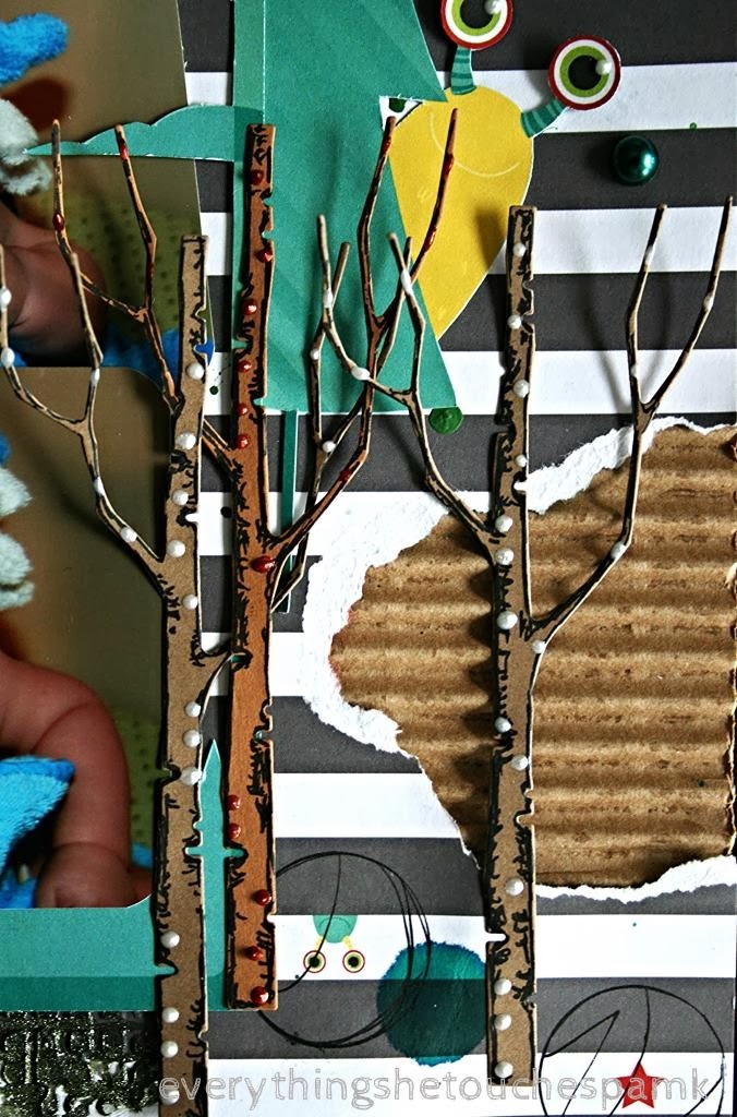
My favourite part of the layout, if I had to choose one other than my adorable monkey, is the top right corner with the mismatched eyes peering out of the ripped page. I haphazardly tore shapes on the top right of the page and on the bottom right of the page and layered corrugated cardboard behind both openings. On the top opening I stapled the cardstock to the cardboard, added embellishments from the Bo Bunny Ephemera pack (pompom string, buttons and google eyes) and two thin bark shavings. Alex has a genuine interest in nature, particularly rocks (harder to scrapbook), and he picked up a couple of bark shavings under one of the trees outside of his daycare one day. I thought the authentic bark played nicely with the campy feel of the Bo Bunny adventure sign, treeline and the memory box die cut birch trees on the bottom of the page. It tied the page together and gave it balance.
Notice the five-eyed monster peeking out in the photo below? Bo Bunny is one of my ultimate favourite designers. Somehow, for me, they always seem to get it right. I'm pretty sure if I took account of my stash I would find Bo Bunny tips the scales in what I own.
While I'm praising Bo Bunny for their designs let me also mention that the Ephemera pack is LOADED with stuff. No seriously. It is loaded. Paper, playing card, ribbons, eyes, brads, buttons, dimensional stick-ons (see the teal one under the pom-pom?) and much much much more. Loaded in one little pack.
There is something fantastic about the adventure post and the treeline part of the Bo Bunny cardstock and I played for a bit before deciding to use it as a frame for the two smaller photos of my monkey-monster. I added Alex's initials to the post as part of a everythingshetouches family tradition of sign carving.
Mr. everythingshetouches and I traveled to Banff one summer and took the photo below. I have an absolute fascination with the mountains and love to take bazillions of photos whenever we get a chance to get to the Banff or Jasper. On this trip we made a few stops along the roadside and I captured the Mt. Kitchener sign in one of my many (bazillions I assure you) photos. Mr. everythingshetouches digitally added our names to the signage and now keep the photo framed in our living room.
I created a collage out of old magazines and an old tattered anime book and used the Bo Bunny monster shape for a template. I then highlighted the monster in Dina Wakley style with my black gelly roll to ground the image onto the page. Have I mentioned that I will be attending a Dina Wakley class this summer at the Inked Stamper? I am so fabtastically excited. Already have my Art Journal Freedom ready by the door to bring for signage. Geek.
I added texture with gel medium, the memory box mesh stencil and Viva 3D Stamp-Paint (moss green - metallic) under the photos for a little sparkle and pop.
Feels great to be able to squeeze a layout into my crafting (still working on the journal). I'm close to a year in the blogosphere and my (largely self-imposed) craft obligations are soaring. I had another idea in the car earlier for an Etsy Shop product. Did I mention that building an Etsy Shop is on my to-do list? I would love to get it up and running by the end of October.
And on a more personal side note, I just selected Alex's K - 6 school. Hard to believe looking back on these photos that my monkey is ready for Kindergarten. Hmm. I should try to schedule that layout for October or November so it doesn't take another five years before I craft his first day at Kindergarten.
I used the Bo Bunny Lil Monster cardstock as the foundation for my layout. I love the black and white stripes and you'll get a better look at the little monsters and stars peering over the lines in the photos below. I circled some of them in the layout to highlight their adorableness. And creepiness; thank you Alex for the correction. Monsters are not adorable, they're creepy. Backseat blogger.
I splattered the background with Dylusions Ink Spray (calypso teal)and green acrylic paint before adding the layers of other stuff.
My favourite part of the layout, if I had to choose one other than my adorable monkey, is the top right corner with the mismatched eyes peering out of the ripped page. I haphazardly tore shapes on the top right of the page and on the bottom right of the page and layered corrugated cardboard behind both openings. On the top opening I stapled the cardstock to the cardboard, added embellishments from the Bo Bunny Ephemera pack (pompom string, buttons and google eyes) and two thin bark shavings. Alex has a genuine interest in nature, particularly rocks (harder to scrapbook), and he picked up a couple of bark shavings under one of the trees outside of his daycare one day. I thought the authentic bark played nicely with the campy feel of the Bo Bunny adventure sign, treeline and the memory box die cut birch trees on the bottom of the page. It tied the page together and gave it balance.
Notice the five-eyed monster peeking out in the photo below? Bo Bunny is one of my ultimate favourite designers. Somehow, for me, they always seem to get it right. I'm pretty sure if I took account of my stash I would find Bo Bunny tips the scales in what I own.
While I'm praising Bo Bunny for their designs let me also mention that the Ephemera pack is LOADED with stuff. No seriously. It is loaded. Paper, playing card, ribbons, eyes, brads, buttons, dimensional stick-ons (see the teal one under the pom-pom?) and much much much more. Loaded in one little pack.
I love the little yellow monster peeking out from behind the tree. I added some definition to the memory box birch tree die cuts with my black gelly roll pen and my Viva Pearl Pen (ice white and red).
Mr. everythingshetouches and I traveled to Banff one summer and took the photo below. I have an absolute fascination with the mountains and love to take bazillions of photos whenever we get a chance to get to the Banff or Jasper. On this trip we made a few stops along the roadside and I captured the Mt. Kitchener sign in one of my many (bazillions I assure you) photos. Mr. everythingshetouches digitally added our names to the signage and now keep the photo framed in our living room.
I created a collage out of old magazines and an old tattered anime book and used the Bo Bunny monster shape for a template. I then highlighted the monster in Dina Wakley style with my black gelly roll to ground the image onto the page. Have I mentioned that I will be attending a Dina Wakley class this summer at the Inked Stamper? I am so fabtastically excited. Already have my Art Journal Freedom ready by the door to bring for signage. Geek.
I added texture with gel medium, the memory box mesh stencil and Viva 3D Stamp-Paint (moss green - metallic) under the photos for a little sparkle and pop.
Feels great to be able to squeeze a layout into my crafting (still working on the journal). I'm close to a year in the blogosphere and my (largely self-imposed) craft obligations are soaring. I had another idea in the car earlier for an Etsy Shop product. Did I mention that building an Etsy Shop is on my to-do list? I would love to get it up and running by the end of October.
And on a more personal side note, I just selected Alex's K - 6 school. Hard to believe looking back on these photos that my monkey is ready for Kindergarten. Hmm. I should try to schedule that layout for October or November so it doesn't take another five years before I craft his first day at Kindergarten.
Tuesday, 19 November 2013
autumn .. the year's last, loveliest smile - william cullen bryant
Autumn has a quiet obscure elegance as the days get noticeably shorter, the colours change and the weather becomes crisp and sharp. Many people love the change from the heat of summer to Autumn. Although writers and poets associate fall with human decline in vitality and the decent toward death; the falling leaves and the slow demise of nature as it prepares for its final days (hmm a little dreary dear), there is also a newness related to Autumn. New pencils, new school clothes, new classrooms, new teachers and some new classmates and the invigorating air brings a freshness and sense of innovation (that's more like it).
I both love and fear Autumn. I love the colours, Halloween and cozy socks. However, I also feel great dismay for the pending winter. Although born in Canada I cannot seem to make my body or mind accept winter as a positive season. No matter how hard I try, thoughts of ice and -30 temperatures do not equal yay, good times. Somehow this year Edmonton has been given a reprieve from an early winter. Each day that the highs are greater than -15 are a cause for celebration. I can feel my friends in Ontario and Montréal cringing. It's a dry -15 which is the east equivalent of -5. Trust me. You can still visit after October 1st.
I am entering my Autumn layout in three challenges this month:
1. Berry 71 Bleu November challenge: Change is beautiful and
2. Happy Accidents and Turning Leaves for Anything But a Card Challenge #29: Fall into Fall
3. Ladybug Crafts November Challenge: Autumn Colours
Alex, mr. everythingshetouches and I along with some friends spent a warm and fun-filled September day at the corn maze last year. Alex and his friend E. started the merriment with a number of jumps from the top of the haystack. I am saving the photos of Alex and E. for a separate layout so stay tuned (and I need permission from E's mom to share his photo with you). Alex loved the freedom and silliness of the straw as it came loose from the barrels and I was surprised that the scratchy texture did not phase him as he tossed it in the air and let it fall all over him. The middle photo is my favourite of the three and I'm so happy that I was able to capture the moment.
I found the leaves and berries at one of the dollar stores in town. Dollar stores have really improved their stock over the years and a little ingenuity and some imagination does not hurt either.
The berries were attached to the corrugated cardboard with a little raw, unmixed and exposed gel medium. I wanted the layout to have a little edge and authentic feel. An Autumn raw crisp feeling. The Recollections: Tattered and Worn cardstock was cut, distressed with vintage photo and layered on top of gel medium/copper acrylic paint with brick stencil. I adore the way this corner turned out. The colours, the lines and the textures really came together.
Using one of my favourite masks: so happy, memories with you, cherished moments I sprayed calypso teal Ranger Dylusions Ink Spray to create an added dimension.
I attached a part of the Pink Paislee treasures cardstock to the background of the layout and added a bit of Gesso for interest and layering. Layered behind the photos is more corrugated cardboard, playing cards and painted/gel mediumed brick stencil.
My goodness. I just took an inventory in my head of all the layouts I have to catch up on. I wish I could say I am only one year behind but that is hardly the reality. The good news is I do not have to wonder what I should be doing next.
Thank you for stopping by and peak in again soon.
I both love and fear Autumn. I love the colours, Halloween and cozy socks. However, I also feel great dismay for the pending winter. Although born in Canada I cannot seem to make my body or mind accept winter as a positive season. No matter how hard I try, thoughts of ice and -30 temperatures do not equal yay, good times. Somehow this year Edmonton has been given a reprieve from an early winter. Each day that the highs are greater than -15 are a cause for celebration. I can feel my friends in Ontario and Montréal cringing. It's a dry -15 which is the east equivalent of -5. Trust me. You can still visit after October 1st.
I am entering my Autumn layout in three challenges this month:
1. Berry 71 Bleu November challenge: Change is beautiful and
2. Happy Accidents and Turning Leaves for Anything But a Card Challenge #29: Fall into Fall
3. Ladybug Crafts November Challenge: Autumn Colours
Alex, mr. everythingshetouches and I along with some friends spent a warm and fun-filled September day at the corn maze last year. Alex and his friend E. started the merriment with a number of jumps from the top of the haystack. I am saving the photos of Alex and E. for a separate layout so stay tuned (and I need permission from E's mom to share his photo with you). Alex loved the freedom and silliness of the straw as it came loose from the barrels and I was surprised that the scratchy texture did not phase him as he tossed it in the air and let it fall all over him. The middle photo is my favourite of the three and I'm so happy that I was able to capture the moment.
I found the leaves and berries at one of the dollar stores in town. Dollar stores have really improved their stock over the years and a little ingenuity and some imagination does not hurt either.
The berries were attached to the corrugated cardboard with a little raw, unmixed and exposed gel medium. I wanted the layout to have a little edge and authentic feel. An Autumn raw crisp feeling. The Recollections: Tattered and Worn cardstock was cut, distressed with vintage photo and layered on top of gel medium/copper acrylic paint with brick stencil. I adore the way this corner turned out. The colours, the lines and the textures really came together.
Using one of my favourite masks: so happy, memories with you, cherished moments I sprayed calypso teal Ranger Dylusions Ink Spray to create an added dimension.
I attached a part of the Pink Paislee treasures cardstock to the background of the layout and added a bit of Gesso for interest and layering. Layered behind the photos is more corrugated cardboard, playing cards and painted/gel mediumed brick stencil.
My goodness. I just took an inventory in my head of all the layouts I have to catch up on. I wish I could say I am only one year behind but that is hardly the reality. The good news is I do not have to wonder what I should be doing next.
Thank you for stopping by and peak in again soon.
Thursday, 19 September 2013
you can't get a cup of tea big enough or a book long enough to suit me - c.s. lewis
Each summer, the daycare that Alex attends, has a tea party for children and parents on the last day before summer vacation. It is incredibly charming to watch one and two year old children sipping lemonade and juice from proper china tea cups and munching on scones and sandwiches. The staff dress up in elegant tea party wear and floppy sunhats and the outdoors are transformed into a lovely tea party. It is quite the dichotomy if you get to witness the effects of International Mud Day which occurs only a few days earlier. The photos used in this layout are from the tea party three years ago; Alex's first summer at daycare July 2010 when he was one and a half years old.
I'm entering this layout in three challenges:
1. Berry 71 Bleu September sketch plus mixed media challenge
2. About A Boy September 1 black white + one challenge. Creating a layout using black, white and one other colour (green).
And 3. Scrap Around the World September 2013 Challenge 5 bold graphic. The mood board is striking and definitely inspirational:
The bottom centre image of the child holding the adult's hand inspired my selection of photos for my layout. It's often fun to observe our children engaging in more "adult-like" behaviours, such as gently sippingtea lemonade from tea cups, however, I don't want Alex to grow up too quickly. I want him to truly enjoy, savour and value his childhood.
I covered the 12x12 manila cardstock with gesso and white acrylic. Across the bottom and up the right-hand side I added homemade crackle. It worked out so well that I decided to use the same technique on the tea cup itself which was cut out with, along with the black and white butterflies, the Silhouette Cameo. The tea cup, saucer and steam were cut out of Tim Holtz grungepaper and the two vellum butterflies were cut out using a Memory Box die cut.
I added green (Dylusions Ink Spray dirty martini) and black (black acrylic paint mixed with water) splatters across the entire layout and a tea cup stain at the bottom right for some whimsy. The black paint mixed with water created tiny bubbles and the effect as they popped was fantastic. Alex is very familiar with the bubble technique. He sometimes uses dishsoap, food colouring and water to create his own bubbly art in a larger bubble version. On small or large scales bubbles are fun, beautiful and make very lovely art pieces.
I punched out the three little butterflies from vellum and tissue paper, placed them on the tea cup and doodled some bits both on the butterflies and tea cup.
I love the layered and rough frame in Debbie's sketch, especially against the delicate butterflies and flowers, and recreated my own pseudo-frame with two different layers of washi tape.
The butterflies were stamped with random images and one was embossed. I was aiming for non-uniformity. Success.
Inspired by Holly's (in the fun lane) post on dipped beads I tried my hand at dipping. I like dipping. A lot. But I have made a mental note to make sure that I (a) secure my dip object to the wire better(one poor bead took a plunge and got a green bath) and (b) secure a proper drying space before dipping instead of running around with a dripping dipped bead trying to find a good location to dry.
I modge podged one bead with green tissue paper and the tissue gave the bead a really nice texture. I love modge podge and tissue. Wonderful and dangerous duo (tissue loves modge podge as much as I do).
I love Alex's expression in this photo below.
Years ago, just after Alex was born, Canadian Tire had an incredible sale on sewing machines. Although I had not sewn anything since Home Economics in grade 8, I had ambition to start sewing. Major project: create new cushion covers for the couch, love seat and chair in the sun-room to match the developing naval theme. Minor project: sew paper and material to incorporate stitching in my paper projects. My ambition remained in the planning stage - until now. I'm still working on lightening up on my lead foot but with a few attempts the end result was successful. Onto the major project! First step: find naval-type fabric. Second step: Check my sewing apprehension at the door and go for it! Maybe step (1a) is: create a small-sized cushion cover. Until then, I will definitely be stitching all over my paper projects.
I'm entering this layout in three challenges:
1. Berry 71 Bleu September sketch plus mixed media challenge
2. About A Boy September 1 black white + one challenge. Creating a layout using black, white and one other colour (green).
And 3. Scrap Around the World September 2013 Challenge 5 bold graphic. The mood board is striking and definitely inspirational:
The bottom centre image of the child holding the adult's hand inspired my selection of photos for my layout. It's often fun to observe our children engaging in more "adult-like" behaviours, such as gently sipping
I covered the 12x12 manila cardstock with gesso and white acrylic. Across the bottom and up the right-hand side I added homemade crackle. It worked out so well that I decided to use the same technique on the tea cup itself which was cut out with, along with the black and white butterflies, the Silhouette Cameo. The tea cup, saucer and steam were cut out of Tim Holtz grungepaper and the two vellum butterflies were cut out using a Memory Box die cut.
I added green (Dylusions Ink Spray dirty martini) and black (black acrylic paint mixed with water) splatters across the entire layout and a tea cup stain at the bottom right for some whimsy. The black paint mixed with water created tiny bubbles and the effect as they popped was fantastic. Alex is very familiar with the bubble technique. He sometimes uses dishsoap, food colouring and water to create his own bubbly art in a larger bubble version. On small or large scales bubbles are fun, beautiful and make very lovely art pieces.
I punched out the three little butterflies from vellum and tissue paper, placed them on the tea cup and doodled some bits both on the butterflies and tea cup.
I love the layered and rough frame in Debbie's sketch, especially against the delicate butterflies and flowers, and recreated my own pseudo-frame with two different layers of washi tape.
The butterflies were stamped with random images and one was embossed. I was aiming for non-uniformity. Success.
Inspired by Holly's (in the fun lane) post on dipped beads I tried my hand at dipping. I like dipping. A lot. But I have made a mental note to make sure that I (a) secure my dip object to the wire better(one poor bead took a plunge and got a green bath) and (b) secure a proper drying space before dipping instead of running around with a dripping dipped bead trying to find a good location to dry.
I modge podged one bead with green tissue paper and the tissue gave the bead a really nice texture. I love modge podge and tissue. Wonderful and dangerous duo (tissue loves modge podge as much as I do).
I love Alex's expression in this photo below.
Years ago, just after Alex was born, Canadian Tire had an incredible sale on sewing machines. Although I had not sewn anything since Home Economics in grade 8, I had ambition to start sewing. Major project: create new cushion covers for the couch, love seat and chair in the sun-room to match the developing naval theme. Minor project: sew paper and material to incorporate stitching in my paper projects. My ambition remained in the planning stage - until now. I'm still working on lightening up on my lead foot but with a few attempts the end result was successful. Onto the major project! First step: find naval-type fabric. Second step: Check my sewing apprehension at the door and go for it! Maybe step (1a) is: create a small-sized cushion cover. Until then, I will definitely be stitching all over my paper projects.
Sunday, 25 August 2013
carnival, fort edmonton park august 2012
One of my favourite outings last summer was our trip to Fort Edmonton Park (see bill's confectionary fort edmonton park august 2012 for more of the story). Alex and I spent some time with friends walking through the park and ended the day in the midway with a ride on the carousel and Ferris wheel.
I started this manila 12x12 with a layer of gesso to prime the page and prepare for empty spaces. The background was created with a layer of carnival images I printed in black & white and sepia, a sheet of white tissue paper, a crazy circle stencil and Tim Holtz distress inks. I used broken china with the stencil and then distressed the edges of the layout with tea dye. I also added some tea drops throughout using Earl Grey.
I love the event banners which line the midway - bearded lady, strongman - and so my version of the advertisement banners was taken from the Graphic 45 Find your Wings and Fly paper. I free-hand drew in posts holding up the banners. I am really enjoying including some free-hand drawing in my pieces. It has a great homegrown authentic feeling.
The prescription eyeglasses are from the Graphic 45 Olde Curiosity Shoppe Collection and I cut the Ferris wheel out with the Silhouette Cameo. The red and white strips beneath the Ferris wheel were b-side scraps from the Graphic 45 Find your Wings and Fly banners.
I had a great deal of fun putting this page together and I definitely will use these techniques again in my art journal (whenever I get that going). Working with tissue paper is incredible. It adds texture and dimension to the art piece and it's relatively simple (as long as you're okay with it not being perfect). I'm entering this page in Simon Says Stamp Carnival Challenge.
Thank you for stopping by and all of the encouraging comments. You're all so very sweet and kind.
I started this manila 12x12 with a layer of gesso to prime the page and prepare for empty spaces. The background was created with a layer of carnival images I printed in black & white and sepia, a sheet of white tissue paper, a crazy circle stencil and Tim Holtz distress inks. I used broken china with the stencil and then distressed the edges of the layout with tea dye. I also added some tea drops throughout using Earl Grey.
I love the event banners which line the midway - bearded lady, strongman - and so my version of the advertisement banners was taken from the Graphic 45 Find your Wings and Fly paper. I free-hand drew in posts holding up the banners. I am really enjoying including some free-hand drawing in my pieces. It has a great homegrown authentic feeling.
The prescription eyeglasses are from the Graphic 45 Olde Curiosity Shoppe Collection and I cut the Ferris wheel out with the Silhouette Cameo. The red and white strips beneath the Ferris wheel were b-side scraps from the Graphic 45 Find your Wings and Fly banners.
I had a great deal of fun putting this page together and I definitely will use these techniques again in my art journal (whenever I get that going). Working with tissue paper is incredible. It adds texture and dimension to the art piece and it's relatively simple (as long as you're okay with it not being perfect). I'm entering this page in Simon Says Stamp Carnival Challenge.
Thank you for stopping by and all of the encouraging comments. You're all so very sweet and kind.
Subscribe to:
Posts (Atom)