Pages

Wednesday, 25 September 2013

pj november challenge: the preparation

I'm planning and preparing to enter PJ Challenge's November Challenge.  It's a two-parter and a doozy.

The challenge: Prepare your materials according to a pre-determined kit (September 30th deadline) and create cards using those materials only (November 1 deadline) until you have nothing left to use.

The kit includes:

- 6 sheets of paper (maximum)


- 5 stamps (maximum)


- 4 inks, dyes, or paints (maximum)


- 3 types of embellishments (as many of each type as you want)


- 2 ribbons or something similar


- 1 drink of choice (water, homemade lemonade, tea, coffee, wine, etc).


I've decided to use washi as an embellishment and as a ribbon alternative.  And I choose to use my "drink of choice" in my cards.  The spray bottle contains water although I seriously think using red wine would be great fun and would result in some pretty fun scratch and sniff cards.

Time to start crafting!

Thursday, 19 September 2013

you can't get a cup of tea big enough or a book long enough to suit me - c.s. lewis

Each summer, the daycare that Alex attends, has a tea party for children and parents on the last day before summer vacation.  It is incredibly charming to watch one and two year old children sipping lemonade and juice from proper china tea cups and munching on scones and sandwiches.  The staff dress up in elegant tea party wear and floppy sunhats and the outdoors are transformed into a lovely tea party.  It is quite the dichotomy if you get to witness the effects of International Mud Day which occurs only a few days earlier.  The photos used in this layout are from the tea party three years ago; Alex's first summer at daycare July 2010 when he was one and a half years old.

I'm entering this layout in three challenges:

1. Berry 71 Bleu September sketch plus mixed media challenge


2.  About A Boy September 1 black white + one challenge.  Creating a layout using black, white and one other colour (green).

And 3. Scrap Around the World September 2013 Challenge 5 bold graphic.  The mood board is striking and definitely inspirational:


The bottom centre image of the child holding the adult's hand inspired my selection of photos for my layout.  It's often fun to observe our children engaging in more "adult-like" behaviours, such as gently sipping tea lemonade from tea cups, however, I don't want Alex to grow up too quickly.  I want him to truly enjoy, savour and value his childhood.  


I covered the 12x12 manila cardstock with gesso and white acrylic.  Across the bottom and up the right-hand side I added homemade crackle.  It worked out so well that I decided to use the same technique on the tea cup itself which was cut out with, along with the black and white butterflies, the Silhouette Cameo.  The tea cup, saucer and steam were cut out of Tim Holtz grungepaper and the two vellum butterflies were cut out using a Memory Box die cut.

I added green (Dylusions Ink Spray dirty martini) and black (black acrylic paint mixed with water) splatters across the entire layout and a tea cup stain at the bottom right for some whimsy.  The black paint mixed with water created tiny bubbles and the effect as they popped was fantastic.  Alex is very familiar with the bubble technique.  He sometimes uses dishsoap, food colouring and water to create his own bubbly art in a larger bubble version.  On small or large scales bubbles are fun, beautiful and make very lovely art pieces.  


I punched out the three little butterflies from vellum and tissue paper, placed them on the tea cup and doodled some bits both on the butterflies and tea cup.


I love the layered and rough frame in Debbie's sketch, especially against the delicate butterflies and flowers, and recreated my own pseudo-frame with two different layers of washi tape.

The butterflies were stamped with random images and one was embossed.  I was aiming for non-uniformity.  Success.


Inspired by Holly's (in the fun lane) post on dipped beads I tried my hand at dipping.  I like dipping.  A lot.  But I have made a mental note to make sure that I (a) secure my dip object to the wire better(one poor bead took a plunge and got a green bath) and (b) secure a proper drying space before dipping instead of running around with a dripping dipped bead trying to find a good location to dry.


I modge podged one bead with green tissue paper and the tissue gave the bead a really nice texture.  I love modge podge and tissue.  Wonderful and dangerous duo (tissue loves modge podge as much as I do).


I love Alex's expression in this photo below.  

Years ago, just after Alex was born, Canadian Tire had an incredible sale on sewing machines.  Although I had not sewn anything since Home Economics in grade 8, I had ambition to start sewing.  Major project: create new cushion covers for the couch, love seat and chair in the sun-room to match the developing naval theme.  Minor project: sew paper and material to incorporate stitching in my paper projects.  My ambition remained in the planning stage - until now.  I'm still working on lightening up on my lead foot but with a few attempts the end result was successful.  Onto the major project!  First step: find naval-type fabric.  Second step: Check my sewing apprehension at the door and go for it!  Maybe step (1a) is: create a small-sized cushion cover.  Until then, I will definitely be stitching all over my paper projects.

Saturday, 14 September 2013

those who dream by day are cognizant of many things that escape those who dream only at night - Edgar Allan Poe

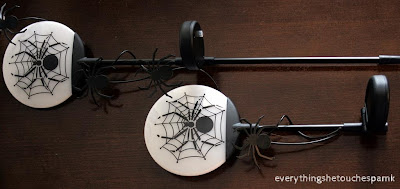
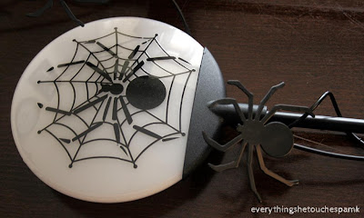
Alex and I found these little beauties at a garage sale for $5.  Both of us are huge Halloween fans (Alex also adores everything spider) and so it wasn't a surprise when they followed us home. 


My vision: the lamps rest quietly until the end of September when all of the Halloween decorations are officially pulled out and added to the lawn and house.  Alex's vision: they are immediately included in his bedroom decor as night lights.  

Issue: finding a location where the lamps don't fall over with every slight breeze.  Solution: re-purpose a flower pot to hold our night lights upright.

The flower pot selected was a once gift from mr. click, print, scrapbook which included a bunch of homemade, gluten-free cake pops (it was mmm mmm delicious).  To create a spooky Halloween-y night light holder I first applied gesso and white acrylic paint to the rim of the flower pot.  The rim was stamped with Archival black ink and a fantastic cobweb and spider wood stamp that I found at Michaels for $1.50.  I also stamped skulls, potion bottles, ravens and potion labels onto the pages of Edgar Allan Poe's collective work (found at garage sale for $.50 and of which we already own a copy.  mr. everythingshetouches was feeling a little uneasy about the book ripping and sacrifice although I tried convincing him that I was using my crafting for good and not evil.  He stills looks at the final product with skepticism.  Oh well) and modge poged the tore pages onto the flower pot.  

The theme-related book and the book pages themselves makes this project a good fit for Anything But A Card Hitting the Books Challenge #27.


The fence and birch trees are Memory Box die cuts.  The stamps were taken from the Graphic 45 Steampunk Spells stamp set and the Ranger dylusions monster mash set.


I free-hand drew the two pumpkins and owl (you know I had to have an owl on there somewhere.  I love Halloween and the freedom of many owls).  Alex is crazy in love with the pumpkin gnawing on the mini pumpkin.  He chose the two pumpkin images from Google so props and thanks to the designers!  Both were coloured in with Distress Inks as watercolours and markers.  Highlights were added with my Viva pearl pen and gelly roll pen.


In a previous life, my craft of choice was painting and decorating flower pots.  I stopped because (a) I needed a new craft challenge and (b) my small apartment could only hold so many flower pots.  I had successfully found new homes for all of my "gifts" years ago (I had given nearly all of them away except for one) so it's been a while since I've worked on a 3D medium.  It takes a respite to appreciate what once was - I had an amazing time designing and crafting this flower pot.  And it was even more fun with all of my new products and toys.  I found the Styrofoam eyes at Michaels for $1.69 each. 


Thank you for stopping by. And with this project we have officially started to decorate for Halloween (don't judge I have shown great restraint; if it was up to me it would be Halloween every day in our house but mr. everythingshetouches disagrees that this is a good idea and so we have some winter-ish things at the end of the year because I'm a good sport and paper lanterns in the sun-room for most of the rest of the year).

Friday, 6 September 2013

phoebe, buttons and poppies banner

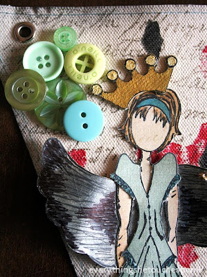
I went back to The Inked Stamper for another amazing mixed media class and this time I got to play on canvas.  We used so many different media and I got fabulously messy making this adorable Phoebe Prima Doll banner.  My end product doesn't exactly resemble Dawn's template.  At the bottom right was supposed to be an alcohol inked heart marked "princess" and my version had turned out well enough, however, the positioning of the heart was really bothering me.  Issue: when you pull up a glossy piece of paper from a printed canvas things don't always turn out so pretty.  When you do it at 10:30 at night your judgement and skill is quite impaired.  It is probably best to wait until morning to exercise a more rationale judgement.  Advice: Don't pull up said paper in the first place or have a darn good back-up plan to fix the boo-boo you create.  My back-up plan: buttons.  It only took 1.5 hours to figure out.  I pulled the green hue from the acrylic painted green stems of the poppies and had a good time hot gluing the buttons to the canvas (that was not sarcasm although at about midnight when I finally decided on buttons "good time" was not the term that I was thinking).


For the backdrop of the banner I used a large script stamped directly onto the canvas.  The poppies were also stamped on using a foam stamp and acrylic paints.  Foam loves paint and the result is fantastic if you are willing to accept some imperfections.  You can ink up the foam stamp quite heavily to get a more pronounced image, however, I didn't want the red to overwhelm Phoebe.

.

The dress was cardstock paper and highlighted with markers and my gelly roll pen.  I painted in Phoebe's hair using Tim Holtz distress ink (vintage photo) and markers.


The adorable lettering was added with a coloured matte gel medium and a stencil.  We added gold to the the gel medium.  Easy peesy coloured gel medium.


My midnight buttons.


Dawn's classes are always fun (and so so messy - makes me so so so happy).  Even with the late night emergency (if only in my own mind) correction I adore this banner and my newest addition to my ladies (I have a growing bunch of girly stamps), Phoebe.

I'm entering my Phoebe banner in the a blog named Hero Challenge #31: Button It!

Here's to late night plan Bs.

Sunday, 1 September 2013

and now for something completely different ..

When one of the deal-of-the-day websites offered a deal on a glass fusion class I hopped out of my chair and onto that train of crazy fun without hesitation.

Lara, owner of the Glazing Pot Studio & Gifts, created an amazing first experience with glass.   It's actually a pretty easy process. You get a base piece of glass and add your glass pieces in a design of your choice.  We made three items in total: two necklaces and one plate.

Necklace One:


Necklace Two:


Finished fired product Necklace One and Two:


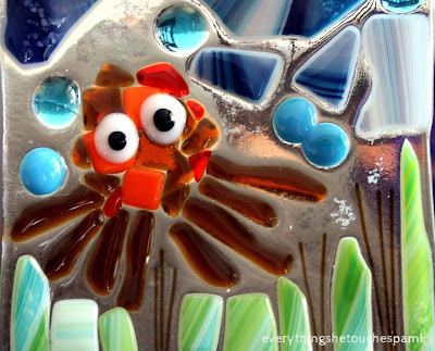
As I was leaving the house for the class Alex asked if I would create one of my pieces for him.  I didn't have much trouble coming up with designs for the pendants, however, with the larger medium the pressure to create was amped and I struggled a bit with deciding on what to design.  I was very grateful, at that point, for Alex's little voice to remind me to devote one of my pieces to him.  My little muse is very much enamoured with octopuses (grab a coffee and take a look at suction cup the yarn octopus).  I created the following piece:


And the final fired product:


My octopus' garden made the Glazing Pot Studio Facebook page!


All three pieces together:


Alex loved the end result so much that we signed up for camp at the Glazing Pot Studio this summer and Alex made a stunning spider in a tree hanging from a web:


I'm entering my glass fusion pieces into PJ Challenge New Technique Challenge September Motivator as my second entry.  It's not a card or a layout or a tag but it definitely is a new technique.

My crafting space is undergoing some minor adjustments and renovations and I am definitely going through crafting withdrawal.  I did manage to open my art journal and start a page which is a great leap in the right direction.  Very happy with the beginnings of my first page and I can't wait to get it ready to be posted and to share.  And thank you for stopping by!  I love the comments and support.  It's incredible to have so many talented people comment positively on my projects.

washi .. pamshi birthday card

Have you had a chance to check out PJ Challenge yet?  My amazing friend Jo (Three Cs) has put together a great blog with the sole purpose to challenge creators and allow us to create using our cache which we collect (that's me using Jo's Three Cs in context (context is a "C" of a different kind - ack double parenthesis!): Collect, Cache and Create).  The prize is self-satisfaction and if you really want to push the envelope check out the New Technique Challenges where you can demo a technique that's "new to you".  You are encouraged to learn something new and then show off your nouveau mad skills in your own project or interpretation.

This birthday card, made for my mother-in-law, will count as one of my two PJ Challenge entries and I am also using it to demonstrate a new technique which I have now added to my ever-growing repertoire.

Washi is a style of paper first made in Japan and it translates to mean Japanese (wa) paper (shi).  For more information on washi link to the wiki page.  Here's my introduction to pamshi - paper created by me, Pam.

How to create your own washi tape in three easy steps for pennies a strip:

1.  Roll your double-sided tape onto tissue wrapping paper.  I like making loads of tape at one time and I love the slight imperfections in the strips as you line up the adhesive and attach it to the paper.  Both items, the tissue paper and double-sided tape, can be found at the dollar store of your choice.  You can play with types of paper (doesn't have to be tissue paper although it does give you that fun transparent style and if you check out my final product you can really see through the paper fringe which is fun) and you can play with the width of your tape.  I didn't want very many thin strips in this project but I did run two thinner strips of double-sided on the pale yellow tissue paper.


2. Rip the taped paper into strips.  And again, you have a choice depending on your style or the style of your project.  You can (a) rip the strips carefully and enjoy the rough edges, (b) cut the strips out to get more accurate and straight lines or (c) combine both techniques.  I, as you might have guessed, am a rip-and-fall-in-mad-love-with-the messy-rough-edges kind of girl but guess what friends - I ended up with (c) combining the two techniques.  Ripping was great for most colours of tissue paper but for some reason (maybe the fibers are more dense for different dyes or different manufacturers make certain colours) some of the colours didn't rip as easily.  To ensure that I didn't muck up the whole strip I ended up cutting some of them out.  You can wait to cut up your strips of washi after you have stamped your images onto the tissue paper, however, I like to capitalize on my paper and so I place the tape rather close to each other and because I didn't want the stamps to run into each other (or maybe I do in the future - that could be fun) I cut the strips out before stamping.  If you notice I left the two lines of thinner tape on one tissue strip and stamped the flowers onto both at the same time (fifth from the top in the image below).

3.  Stamp the tissue paper side of the strip.  Et voilà. Washi tape haute couture to match your project.  You may use whichever stamps you have in your arsenal, however, I found the ones that work really well are those that repeat in pattern or are small enough to repeat by hand.


Side note: enjoy the messy.  Imagine this:  tissue paper all over my work table and strips of double-sided tape sticky side up.  It didn't take long for one of those lightweights to accidentally get stuck onto my double-sided tape in a crazy random askew kind of way.  As I gently pulled the tissue from the tape, thinking I would just have to cut that section out I had a lightbulb moment: enjoy the messy.  I decided to rip up tiny pieces of tissue and randomly stuck them onto the double-sided tape.  Hence the two strips of messy pamshi which somehow reminds me of ballerina tutus. Seriously, this was the most fun I had in creating this project.  There will be more messy pamshi in the future!


The end product:


Prima Doll's backdrop was created with Tim Holtz's distress inks (tea dye, black soot) on watercolour paper.  The Prima Doll, herself, was stamped onto script cardstock paper from the Recollections: Tattered and Worn ginormous book of cardstock paper and her dress was made from scraps of various cardstock paper and leftover wrapping paper (see mr. everythingshetouches? there is sometimes a method to my madness in keeping random wrapping and packing materials which means there has to be a different better nicer word than hording).

The wings (Graphic 45 Steampunk Spells stamp set) were stamped onto the same script cardstock and highlighted with my Viva pearl pen.


The Happy Birthday tag was created from leftover watercolour paper from the main backdrop and distressed with black soot.  The brad is from Recollections collection and the little butterfly punch was a treasure found for $1.50 at Michaels.


I had been playing with the idea of this card for a few months.  I really wanted to highlight the washi tape and keep its integrity.  The front of the card is, therefore, a bit shorter than the back and the washi tape is a fringe along the length of the card.  I adore the transparency and delicate personality of each strip.  


PJ September Challenge #2 soon to follow: stay tuned my wonderful blogster friends.  And I greatly thank each one of you for the amazing words of encouragement.  You're all so very very sweet.