Pages

Sunday, 30 June 2013

Montreal - October 2009 PJ Anything Goes Challenge

For those you who have been following my blog you'll notice that Alex is slightly younger (by about 4 years) in this layout.  No, I haven't resurrected an old layout to enter into the challenge, I'm behind in my scrapbooking by about .. well, four years.

Challenge?  This layout is my first Anything Goes motivator in the PJ Challenge.  PJ Challenge is a central location where crafters can showcase their work.  You should check it out.

Alex was less than a year old when I took him to visit my family in Montreal.  If you haven't had the chance to visit I strongly recommend.  It's absolutely fabulous nine months of the year (January has its moments, however, it can end badly and February/March are just unpleasantly cold and humid - the city is still fabulous regardless if you stay indoors).  And yes, the visit will be worth the six or eight kilos you'll gain trying all of the delicious foods.  Seriously.  Six kilos in one week.  It's that good.

The layout started with a few small finds.  I had some old postcards that I decided to cut up, the street sign and the Montreal paper, however, it gained real charm when I found the scrabble tiles, the bottle caps and bottle cap centres and the Home Decor screen prints (it's hiding behind the photo frame and street sign) at Treasured Memories.  


Montreal conjures up thoughts of family, friends, haute couture, charm, elegance, antiques, wine, fashion, and everything French.  It conjures up ideas of food as well - I just wasn't in the mood to add a croissant or smoked meat sandwich to the layout but perhaps I might model the third page (yes, I have one more) in the form of a cafe .. 
 
I absolutely love the screen print. The carte postale stamp, washi tape and bottle caps add playfulness to the piece.


The pennants and brads seemed to really fit in with the Montreal concept in their design and gave the page an additional layer and dimension.  Very simple concept for a great effect.


The corners of the photo frame reminded me of the fleur de lis and I thought it added some really nice depth to the layout.  I distressed a frame that I found at Michaels and stamped it using my trusty little music stamp to anchor it on the page.  The darling playing with Alex is my niece.


The scrabble tiles provided motivation to get this layout completed.  They were terribly fun to work with and I have to use tiles again in a future project.  They were affixed with a hot glue gun (both to each other and the paper and to my fingers).


The second page of the layout was equally fun to design and create.  I wanted continuity between pages and used some of the same materials.  The Montreal paper was cut in half to use on both pages and I carried over the screen prints, washi tape and bottle caps.
 

I found a new passion for doodling and I find that it really gives the layout (or card or tag) weight.  It really makes the image, whether it's a photo or a stamped image, come to life.  I was very excited to find some great metallic markers on the less expensive and have used them to doodle around the page particularly on the postcards.


I also doodled the bike wheels and handlebars.  The sign was distressed with Tim Holtz distressing ink (vintage photo).  The vellum printed banner added a little semi-hidden touch and dimension.


The bottle caps were a fun find.  I've recently seen a demo where they hammer the bottle caps flat.  I'm not sure why.  Part of the charm is the layer of height.  I might change my mind when I (a) tear the protective sheet or (b) can't close my scrapbook because I have too many added dimensions.  Hmm.


I better get cracking on the third page or I'll never have continuity.  I've been learning and experimenting with a whole bunch of new techniques lately.  It will definitely be more difficult to return to a previous style once too much time has elapsed.

Stay tuned for page three of the Montreal adventure!


Wednesday, 26 June 2013

fashion is not something that exists in dresses only. fashion is in the sky, in the street, fashion has to do with ideas, the way we live, what is happening - Coco Chanel

It's my friend Jo's birthday (check out her blog: Three Cs).  When I think of Jo I'm reminded of simple beauty, clean lines, white, haute couture and laughter.  Et voila.  Jo's birthday card.


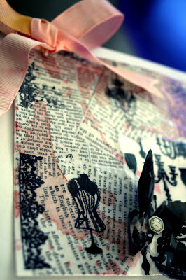
The screen print (home decor - bottom right) and the rubber stamps (there are five used on the newspaper print - can you spot them?) went hand in hand as if they were always meant to be together.

The focal paper is a homemade collage incorporating the home decor screen print with newsprint paper.  This was my first attempt at integrating collage into one of my paper crafts.  I was a little worried about how the inks would respond to the liquid glue sealer, however, there really wasn't any need to fret.  It turned out extremely easy to work with - as long as you leave it alone to dry (or use a heat tool).

I distressed the collage with Tim Holtz distressing ink (worn lipstick, vintage photo) using the Prima Donna Downey Studios Perforated Dot Flower stencil to create a designThe final product looks like the newsprint had some rosy tea stains.  I anticipate a lot of fun and play with ink colours and collage in the future.  I'm very much sold.


The little butterfly was stamped with Archival Jet Black ink onto the home decor screen print, cut out and affixed with a Recollections brad.


Jo designs and sews clothes as one of her passions.  How great is this dress form stamp?  And I love the chandelier hanging in the middle of the page.  If I had to pick a favourite it would be the chandelier or the little bunch of flowers near the ribbon.  They're all so sweet, how can you pick just one?


The ribbon was actually plain white and I distressed it using Tim Holtz distressed paints (picked raspberry, mustard seed).  I'm not sure why I wanted to introduce another colour to the card at this point.  I love pinks, oranges and yellows.  It just seemed to be the right thing to do and I like the way it turned out.  I debated going over it with a smidgen of vintage photo or tea dye and decided against.  The brightness of the ribbon matches the gloss of the collage and contrasts with the vintage photo stained newsprint.


I've entered this card in the Simon Says Stamp Challenge Blog - Anything Goes.

Jo introduced me to the world of blogginess and rekindled my passion for nearly everything crafty (paper craft, jewelry and photography)!

Thank you, Jo, and have a very happy, relaxing and inspirational birthday!!

Monday, 24 June 2013

suction cup the octopus

It's not a paper craft.  It's not jewelry.  It did permit me to take a photograph of it.

I had learned to make octopuses out of yarn when I was in elementary school (grade 2 to be exact) and in conjunction with Alex's absolute adoration for this cephalopod and a touch of nostalgia I pulled out my bag of yarn and googly eyes.


My muse is very much into the Wild Kratts and impresses me daily with his knowledge about animals and wild life.  The other day he pointed to a bird in a book and informed me that it was a Peregrine Falcon (I had to read the caption - he was right, of course).  He asked, "Mom, where can we find Peregrine Falcons?" I answered that when the zoo opens for the summer we will be able to see one there.  Alex's response? "No.  They are found in the forest.  Good on you for trying."

Cheeky monkey.


Alex had been asking for a new octopus for some time now.  We have octopuses in many varieties - those that grow in water, ones that walk down walls, one made out of a toilet paper roll (Alex's creation) and now one in yarn.  Alex named our newest yarn friend Suction Cup.


Suction Cup was the snuggle stuffie of choice last night for bed and this morning he was shooting through the air in the dining room.  Alex had to show Mom and Dad how Suction Cup's jet propulsion works (it works all too well as Suction Cup blasted into walls and the ceiling a few times).  I'm not too worried about Suction Cup's durability.  For a half ball of yarn, two googly eyes and a ball of styrofoam I think there will be many Suction Cups to come!

Sunday, 23 June 2013

graffiti art meets tag

I have been playing with a lot of techniques lately.  Working them out in isolation and seeing how well they play together.

I've recently rediscovered the world of collage and created my first collaged card (to be posted later this week - it's birthday time sensitive). The success had me eager to try my hand again.  It was the desire to collage and the graffiti art found downtown Edmonton that became the tiny planted seeds I needed to create my tag for the A Blog Named Hero challenge (challenge #26 #tag).


To create the base of the tag I used Tim Holtz distressing inks (tea dye, peacock feathers, vintage photo) and some left over splatter from a Dylusions Spray project (dirty martini).

I printed off the photo that I had taken of the graffiti art onto regular white printer paper, tore the image to give the edges some personality and distressed it using vintage photo.  I'm not sure you can see the lines of the liquid glue running across the tag. I think the lines add some very nice texture.  It wasn't part of the original plan, however, the brush I used was stiff and I had an instant love for the ridges.  I was hoping to get a little resistance from the stamping to the glue ridges, as you can see in the bottom right corner with the flower bunch, however it wasn't going in that direction in the rest of the tag.


With everything set in place and the wings (the wings are Tim Holtz, however, I'm not sure which set this came with - my apologies) stamped on, I began to doodle. 

I highlighted some of the flames with Heidi Swapp's neon pens and used Ranger Distress Marker (Picket Fence)to really bring the two images together and anchor the photo onto the tag.  I doodled with metallic markers to anchor areas and to bring attention and emphasis to places that were somewhat lost beforehand.  I love the micro-dot stamp which gave the overall image a worn-in appearance.


 Viva Decor's Pearl Pen has a translucent gel quality which if used on water-based products can pick up some of the inked colour when doodling.  I, however, sealed my inks with the liquid glue and the result was a shimmery pearl design and highlights throughout the photo.  A touch of semi-bling.


The tag was quite naked without ribbon and I toyed with the idea of distressing white ribbon and mucking it up with a heat tool to make it more worn-in and messy.  I decided, however, to go with a combination of different lengths in ribbon in different colours, all distressed with vintage photo and tied it together with a touch of jute.  The effect was spot on.


It was really great fun making this tag and having free rein with my design.  My next few projects have a pretty set direction and I'm glad I had the opportunity to get messy and play.

Grab a coffee, look around, say hello.

Sunday, 16 June 2013

best of times, best of dads

My husband loves this photo of Alex.  Alex had been hanging out with Dyeda in the basement (also referred to as the treasure cave where one man's treasure is .. well, I wasn't entirely fond of the 30 year old rabbit's foot that had to come home with us - rabbit's feet start to shed when they reach a certain age) and found these great headphones.

I linked the 70s-style headphones to music, handlebar moustaches and a time stamp to reflect an era of yesteryear.  I really like the way the theme of this card came together and that it maintained its meaningfulness and purpose - Father's Day.


To create the backdrop of the card I used Tim Holtz Distressing Inks (broken china, tea dye) and Prima Donna Downey Studios Perforated Dot Flower stencil.  The results gave me goose bumps.  I never had so much fun using a stencil before.  I very much liked the way the distressing turned out, however, I wanted a bit of pop and began doodling using a metallic marker.

I used stamps from 7 gypsies and Tim Holtz Visual Artistry Collection Stampers Anonymous.  My trusty musical stamp made an appearance on the photo.

If you notice off to the side there is a dotted strip of paper with cross-stitching and again a strip at the top of the card which functions nicely as a disconnected frame.  This is my first attempt at stitching on a paper craft.  I've been meaning to dig my sewing machine out of the basement for a while (I really want to re-cover my cushions in the sunroom).  However, I have so many new paper craft goodies I'm not sure it'll happen this summer.  Maybe a few more stitching pieces and I'll get the itch for a bigger accomplishment.


The image behind Alex was embossed with a Sizzix moustache embossing folder I found at the Inked Stamper.  I distressed it with Distressing Paint (picket fence) and Distressing Ink (vintage photo).  Recollections is responsible for the moustache and screw brads.  I decided to add a little ribbon for colour.  The back of the ribbon was stark white and to not have it become so incredibly prominent, I distressed it with vintage photo.


In order to really make the photo part of the card I added the stamp and some metallic doodling.


Happy Father's Day to all the great dads out there.  And a very very special Father's Day to my guy, Alex's dad.  We love you to bits and pieces xx

Saturday, 15 June 2013

home is the place, when you have to go there, they have to take you in - Robert Frost

Family.  Unconditional love.  Pancakes for dinner when you have a bad day.

My father-in-law is a true family man.  I can hardly remember a time when I've asked for his help and was refused.  I ask, he's there.  Sometimes you have to be careful to not accidentally ask for things like when you can't see your ornamental bridge behind the evergreen in your backyard and the next thing you know your evergreen's bottom layer of branches have moved from a few centimeters above the ground to about 2m up the tree.  His intentions are always good.

It was a seamless transition from daughter-in-law to daughter.  Is that common?  I was immediately considered part of the family, instant adoption.  We laugh, disagree and protect each other (he does more protecting, I do more protect-receiving).  I look to him for advice and wisdom and I am not short on a very long list of Dyeda-isms (Dyeda's words to live by).

Alex adores his Dyeda and the feeling is mutual.  They are thick as thieves when they hang out together.  I see Dyeda's strong character, curiosity and love for apples in Alex. 

The neighbourhood is a Stampin' Up rolling stamp inked over Tim Holtz Distress Paints (forest moss, salty ocean, rusty hinge).  I used regular cardstock and although you might want to prime it first to avoid the warp, I actually enjoy texture.  I'm not sure the camera did justice to the movement.


I created an border underneath the neighbourhood and distressed the edges with Tim Holtz distress ink (vintage photo) to give it more dimension.  My husband loves the screw-design brads but was slightly disappointed that Recollections didn't provide the entire possible gamut of screws.


The sweet sweet clouds were embossed and partially distressed using Tim Holtz Distress Ink (peacock feathers).  The outline of the houses, cloud colour and scribbles were made using Ranger Distress Marker Picket Fence.


I have to wait until Monday (or Sunday night if I can borrow a few minutes) to post my husband's card.  My goodness, June is turning out to be a very busy card month.

Thursday, 13 June 2013

mentor, pragmatic, wise .. thank you

I'm graduating.  Work invested in me and my future by encouraging me to enroll and participate in a leadership program.  It was an eighteen month commitment and really well worth the time and energy.  If you would like to improve your leadership skill set check out Kouzes and Posner's work.  I recommend.

What on earth does this have to do with a paper craft?  Clever.  You've noticed the title, put two and two together and realized that I can barely say no to the simple six-word query: Pam can you create a card?

Leadership participants were organized into groups of six or seven members.  We created an identity, selected a group name and became a support system for each other in our journey.  The chief support was our mentor.  A Leadership Program Alumni.  A fearless leader to champion our development, to encourage our progress and carve the path to success (kick butt, take no prisoners, teach us the way of the guru).

  
I capitalized on an opportunity to try my hand at distressing using Tim Holtz distress paints (salty ocean, seedless preserves, picked raspberry).  I added some depth and texture with the distress inks (peacock feathers, vintage photo) and was very excited with my final product.  The stamp is from the Dylusions Couture Collection inked with the Archival Ink Jet Black and outlined with Ranger Distress Marker Picket Fence.  Fun to use distress markers?  You bet.  I felt like Agent 355 when the distress marker went on clear.  My etchings were secret code until they dried.  


I selected three key words to best describe our captain: mentor (sometimes simple and obvious is best, plus I had to start somewhere), pragmatic and wise.

The tags were distressed with peacock feathers and vintage photo inks on white textured cardstock, braded (nouveau word?) and popped up to give zing.

Although I had stamped over the paper break at the top of the card to bring some unity, it still seemed really disjointed so I added a dash of washi tape.  Did the trick.  I learned how to make my own washi tape and tried it out a few days ago.  Turned out pretty nicely.  You can expect to see homemade washi (will I then call it pamshi?) tape.


Studio G has some very nice materials for a great low price.  The thank you brad is a Studio G design and I used Studio G ink for the musical notes.  I love the way colour leaps up against the tag colours and gives the image some additional dimension.  The floating butterflies are stamped in Studio G grey ink and highlighted with the Picket Fence distress marker.  It was liberating being messy.


I decided that the tag really needed to be the focus of the card and maintained the surrounding colours in neutrals.  With the monotone colours, I wanted to draw your eyes around the page and not have them get stuck in any one area. I was really pleased with the silver embossing.  The embossing powder clung to the musical stamp accidentally, however, and the result is like controlled chaos.


What I haven't shown you is the inside.  So fun!  The group, for the graduation ceremony, had to find avatars to represent themselves for the table decoration.  I used copies of our avatars in lieu of our signatures.  Turned out very cute!

Sunday, 2 June 2013

A wise old owl sat on an oak; The more he saw the less he spoke; The less he spoke the more he heard; Why aren’t we like that wise old bird? - Edward Hersey Richards


I designed and created this card for my amazing friend, Matt (Click Print Scrapbook or CPS Blog). His favourite colour is blue and that served as one of three inspirations for his birthday card.  


The other inspirations come from my love of owls and circles or dots.  Do you ever find yourself attracted to some artwork or embellishment, sticker set or stamp set?  Sure.  And when I ask myself what it is that drew me in to falling head over heels with something I usually can find a few little nuances of myself in the item.  I am often attracted to things which include owls and dots.  Dresses, jewelry, scrapbooking materials, home decor and stuff in general that incorporate owls or dots in the design (can you imagine if it had both? I would be over the moon!)always catch my attention, attract me and take great energy to not bring homeIt's a good thing that I am (a)able to put things back on shelves and(b)not willing to have everything in my life become one-dimensional.  I love variety and I consciously decide and seriously consider which item comes home with me.  This little one was a gift from my friend, Sveta, who lives in Israel.  It surprised me that she remembered my adoration for owls because we never really talked about it.  In fact, I've never talked about owls as much as I just did.  I guess you bring out the chit-chatty in me.  If you look really closely you can see this momma owl has a little guy in her belly.  Sweet little momma owl.


How do you bring all these different ideas together to make a cohesive card that works?  Make sure you have colours tying in the theme or, in my case, themes together and use a ribbon.


The base of the large owl tag was created using Tim Holtz Distress Inks (vintage photo, broken china and spiced marmalade).  The owl is courtesy of Recollections Cling Stamps and the coloured touches have been made possible with Marvy BRUSH MARKERS (no. 64 plum, no. 92 celery and no. 6 brown).


I really have to thank Dawn, owner of The Inked Stamper Scrapbook Store for taking time late one Friday afternoon to demo the distressing inks and more importantly to allow me to be messy and set my inner mess free.  If you ever get a chance, because you're roaming the streets in Edmonton/St. Albert, take the time to stop in.  It really is worth your scrapbooking time.  Dawn also sold me on the importance of Ranger Archival Ink Jet Black.  This ink kicks ink butt.

The leaves are part of the Recollections Cling Stamp pack that came with the owl and the brad is also a Recollections piece. Notice how the music stamp made an appearance?  The ink colour is fantastic and gives it so much punch (made by Studio G).


The mini owl is tied on with jute.  It's a Stampin' Up punch.  I couldn't resist.  A punch owl.  Seriously.


I had to finish the back of the large tag given that it hangs over the backside of the card.  I used the same paper as the mini owl and the front of the card to bring in some continuity.  It's cardstock taken from the Recollections: Tattered and Worn paper pad (the thing is so large and packed with amazing paper someone could get hurt).


I love the colours and feel of the argyle cardstock but I really fell in love with the circle images which was taken from the same Recollections package.  The sheet was covered in circles and I cut out a few select ones which I thought were fun.  It was a bit of a stretch to bring the pink in but I like the contrast to the other colours.  It adds a little je ne sais quoi - n'est ce pas?  The soft blue paper was embossed with a Happy Birthday cartridge and the ribbon pulls in some of the rusts, oranges and mustard in the argyle pattern.


I found the bottle cap embellishment at a local scrapbook store Treasured Memories.  It's a fun little store where they make some of their own embellishments (they didn't make the bottle cap.  That came in a bag of many).  The owl in the centre of the bottle cap is from the same circle image paper. Fits very nicely, I think.


I thought the top of the card needed a little movement and by cutting out the diamonds and popping them up I added some whimsy.


I used all of the same materials on the inside of the card to keep the idea continuous.  I distressed the Happy Birthday tag with Tim Holtz Distress Inks (vintage photo, broken china and spiced marmalade) again and stamped the message in the Ranger Archival Ink Jet Black (I love this ink!).  Simple.  I like to keep my busyness to the outside of the card.


I waited to post this card because I didn't want Matt to see it before the official presentation which was earlier tonight.  The party was incredible and I'm so grateful to have such amazing friends.  My family and friends are for whom I design and create.  They are the reason I enjoy loading my work up with love and appreciation.

I think the next few posts will be devoted to Father's Day cards.  Check it out soon!